A builder's website should look as good as the homes the builder makes. That starts with real photos of your own work, a first screen that says what you build and where, and a button that asks for an estimate. Branding comes second and it's simpler than you think.
 1:29Watch the videoHome Builder Website Design: Photos, Homepage and Menu
We made a matching video for this one. This article walks through the homepage order, the menu, the team photos and a basic brand kit.
Your photos are your design
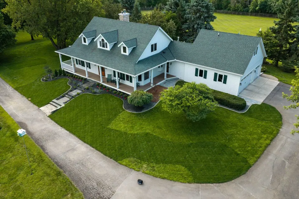
Before you pay for a new theme, new fonts or a new logo, pay for great photography of your own homes. Buyers can tell stock from real in a second. And stock looks like stock, so it makes you look like every other builder in the area.
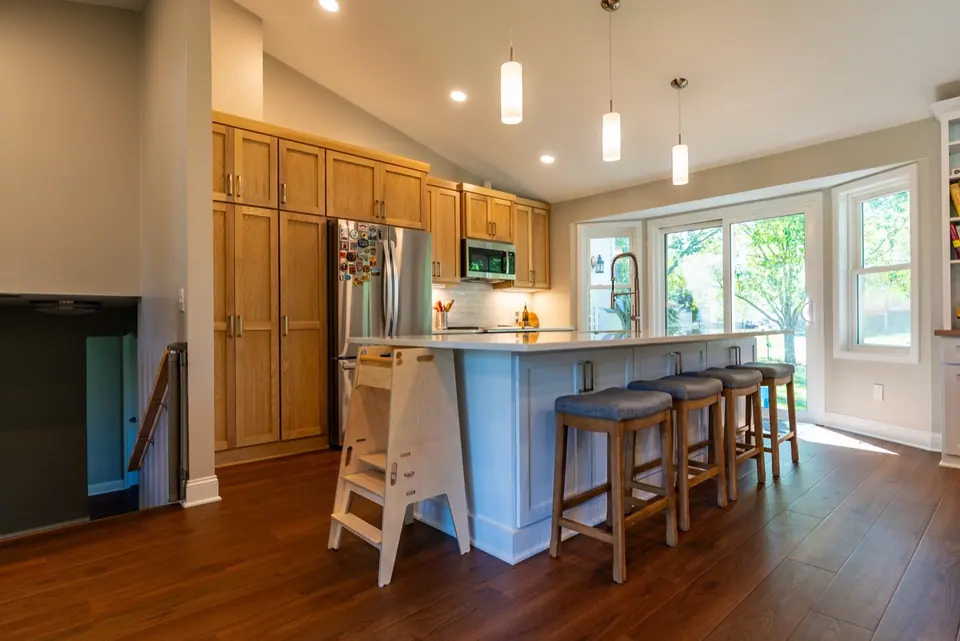
Think about what a buyer is doing. They're picking someone who will be in their house for months. They want to see your work, your crew and your standards. A photo of a kitchen you built says more than any paragraph.
If you can only do one thing this month, schedule a photo shoot of your best three projects. Shoot them in good light, with the clutter gone and a few shots that show the details.
The homepage, top to bottom
Build the page in the order a buyer thinks.
- First screen. A big photo of your best project. One line on what you build and where. Right there, a Request an Estimate button, your phone number and your Google rating.
- Your projects. So they can see the work before they ever call you.
- Your process. What happens after they call, in four or five steps.
- Your service areas. So they know you work where they live.
If you're a remodeler, change the first line to match. Kitchens, baths and additions for homeowners in your area works better than quality craftsmanship.
Organize the menu by project type
Buyers don't think in services like general contracting or design-build. They think in rooms and projects. Kitchens, bathrooms, basements, additions.
Set your menu the same way, so a buyer can find the project they have in mind in one click. Behind each one, build a page with your best photos of that type, a short description and the same Request an Estimate button.
Swap the generic contact form
Contact us tells a visitor nothing. Book a Design Consult tells them what happens next. A specific button name makes people more likely to click, and it filters out folks who just want to ask a random question.
Keep the form short. Name, phone, email and a line about the project is plenty. You can ask more after they book.
Show your team in real settings
Your crew will be in the house for months. A buyer wants to know who those people are. Show them on a job site, talking to a homeowner, holding a plan. Skip the staged group photo in front of a truck if you can. Real beats posed.
Add first names and a line about each person. People hire people.
Branding is simpler than you think
Builders overthink this. You need five things.
- Two or three colors
- Two fonts
- One photo style
- One plain promise
- The same voice everywhere
Then use them everywhere. Put the same colors and logo on your trucks, signs, shirts, proposals and website. When a homeowner sees your truck on the road and then your site online, it should feel like the same company. That repetition builds trust more than any one clever design.
A worked example
This one is an illustration, not a real client. A custom home builder has a site with a stock photo of a living room, a menu with Home, About, Services, Gallery and Contact, and a generic contact form. He books a half-day photo shoot of two finished homes. Then he changes the first screen to a big shot of his best kitchen, with the line custom homes and remodels in his area. He adds a Request an Estimate button and his Google rating. He changes the menu to Kitchens, Bathrooms, Basements and Additions. He renames the contact page Book a Design Consult. Nothing was redesigned. The site just got honest.
The mistake to avoid
The mistake is trusting a template. A template looks fine until you drop in your own photos and words. If you use one, plan on replacing the images, rewriting the text and trimming anything that doesn't fit. Otherwise you end up with a site that looks like a thousand others.
Pages every builder site needs
- Homepage
- Projects
- Service pages
- Process
- Service areas
- Reviews
- About
- Financing
If you're missing any of those, add them in that order, starting with the ones a buyer looks for before they call.
Your Monday-morning list
- Book a photo shoot of your best projects.
- Rewrite the first line as what you build and where.
- Add a Request an Estimate button and your phone number to the top.
- Change the contact page to Book a Design Consult.
- Rename the menu by project type.
- Pick two or three colors and two fonts, and write them down.
Want a second set of eyes on your site?
Book a $99 audit call with me. I'll go through your first screen, your photos and your pages, and tell you what I'd fix first. You'll leave with your top three fixes. Book here: https://www.feedbackwrench.com/book
Questions people ask
What should a home builder's homepage show first?
A big photo of your best project, one line on what you build and where, a Request an Estimate button, your phone number and your Google rating. Put those in the first screen so a buyer knows they're in the right place.
Are stock photos okay on a builder website?
They hurt more than they help. Buyers can tell stock from real in a second, and your crew is about to be in their home for months. Pay for great photography of your own homes before you pay for anything else.
How should I organize my website menu?
Organize it the way buyers think, by project type, like kitchens, bathrooms, basements and additions. That's easier to scan than a list of vague services.
Should I use a generic contact form?
Swap it for something specific, like Book a Design Consult. A specific name tells the visitor what happens next and feels less like sending a message into a void.
What are the basics of branding for a builder?
Two or three colors, two fonts, one photo style and one plain promise. Put it on your trucks and signs too, so you sound like the same company everywhere.

Rob built Feedbackwrench and Nuance Financial Tax & Accounting. Since 2015, our team has helped transform 550+ small businesses with marketing, strategy and systems.