Brand and design standards give you one look everywhere, on your trucks, site, ads and proposals. A short brand guide with logo, color and type rules, a photo style and templates makes you look as established as you really are, before the first quote. Message comes first, design second.
 2:13Watch the videoBrand and Design Standards: One Look Everywhere
Line it all up on a table
Quick question. If I lined up your truck, your website, your ads and your last proposal on a table, would they look like the same company?
Be honest. For most owners, no. Not even close.
- Your truck has the logo your nephew made years ago.
- Your website is a different blue, with a different font.
- Your ads look like they belong to somebody else's business.
- Your proposals are a Word doc with a stretched logo on top.
Every one of those little mismatches costs you trust, before you ever get to quote the job. Buyers size you up fast, and when your look jumps around, you seem smaller than you are.
What one look gives you
Consistency isn't about being fancy. It's about being recognizable. When someone sees your truck, then your site, then your quote, and it all feels like one company, they relax. They think this business has been around and knows what it's doing.
That feeling is trust, built before anyone picks up the phone.
The pieces of a simple standard
You'll end up with a handful of things that fit in a short guide.
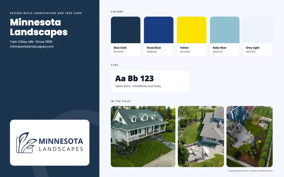
- A brand script. Your message, in plain words. Who you help, what problem you solve, what happens when they hire you. Design starts here.
- Logo rules. Which version to use where, how much space around it, and what not to do to it.
- Color rules. A small set of colors with specific values, so the blue is the same blue everywhere.
- Type rules. One or two fonts, and when to use each.
- Photo style. Real people and real work beat stock, every time. Say what a good photo looks like for you.
- Templates. Ready-made versions of the things your team makes most, like proposals, invoices, social posts and flyers.
Keep the guide short enough that people actually read it. A thirty-page brand book that nobody opens does less than a two-page guide on the wall.
Message first, design second
Why does the message come first? Because design is a way to say something. If you don't know what you're saying, you can't tell whether a design says it well.
When we build a brand, we start with the brand script. Once that's clear, we choose the logo, colors and fonts so they support the message. Then we set the photo style and build templates.
Skip that order and you end up with a pretty logo that doesn't mean anything to buyers.
Where it goes to work
Once the standards exist, they show up everywhere.
- Your website, first. It's usually where the brand gets built out.
- Your videos, with the same look and feel.
- Your ads and social posts.
- Your proposals and invoices. These are often the last thing a buyer sees before saying yes, so they're worth getting right.
- Your AI tools, which can work from the same standards so what they write and build sounds and looks like you.
That last one matters more every month. If you give AI a clear set of rules, it can draft posts and pages that fit. If you don't, it gives you generic stuff.
Monday morning action list
- Collect your truck photo, your website home page, your latest ad and your last proposal. Put them side by side on a screen.
- Mark every difference you see. Colors, fonts, logos, tone of voice.
- Write one sentence that says what your company does and who it's for.
- Decide who on your team will own the brand rules. One person keeps it consistent.
A quick test for any piece of marketing
Before anything goes out, run it through five quick questions.
- Would a stranger know it's from your company without seeing the name?
- Does it use your colors, fonts and logo the way the guide says?
- Is the photo real, showing your actual people or work?
- Does the language sound like how you talk to customers?
- Does it say one clear thing, and is there one clear next step?
If the answer to any of them is no, fix it before you post it. This check takes thirty seconds and saves you from the slow drift that makes brands look sloppy.
Why proposals and invoices matter more than you think
Owners spend a lot on the website and almost nothing on the proposal. But the proposal is where the buyer decides. If it looks thrown together, it quietly says your work might be too. A clean template with your logo, colors and a clear layout tells the buyer you're organized and professional.
The same goes for invoices. A polished invoice is also the last impression you leave, and it's often the thing that gets sent to a friend who asks for your name. Treat those documents like part of your marketing, because they are.
The mistake to avoid
The mistake is skipping the guide because you're small. Small businesses need it most, because a polished look is one of the fastest ways to look bigger than you are.
The other mistake is letting every person improvise. If someone is making a flyer at ten o'clock at night with whatever fonts are on their computer, it won't match. Give them a template and the problem goes away.
Let's take a look
I'm Rob. On the audit call I'll look at your website, your ads and your proposals, see what's working and what's off, and show you what I'd do to grow your business profitably. You'll leave with your top three fixes.
Book the $99 audit call, grab a time, and let's take a look.
Questions people ask
Why does consistent branding matter for a service business?
Buyers size you up fast. When your truck, website, ads and proposals don't match, you look smaller than you are, and that costs trust before you quote the job. One consistent look makes you seem established.
What is a brand guide?
A brand guide is a short document with your logo, color and type rules, photo style and templates. It should be short enough that people actually read it.
Should I do the message or the design first?
Message first, design second, always. Your brand script decides what the design needs to say. Then you choose a logo, colors and fonts to carry it.
Why use real photos instead of stock?
Real people and real work beat stock every time. Buyers can tell the difference, and real photos build trust that stock can't.
What does AI have to do with brand standards?
If your AI tools work from the same standards, what they write and build sounds and looks like you. Brand rules give AI something to follow.

Rob built Feedbackwrench and Nuance Financial Tax & Accounting. Since 2015, our team has helped transform 550+ small businesses with marketing, strategy and systems.